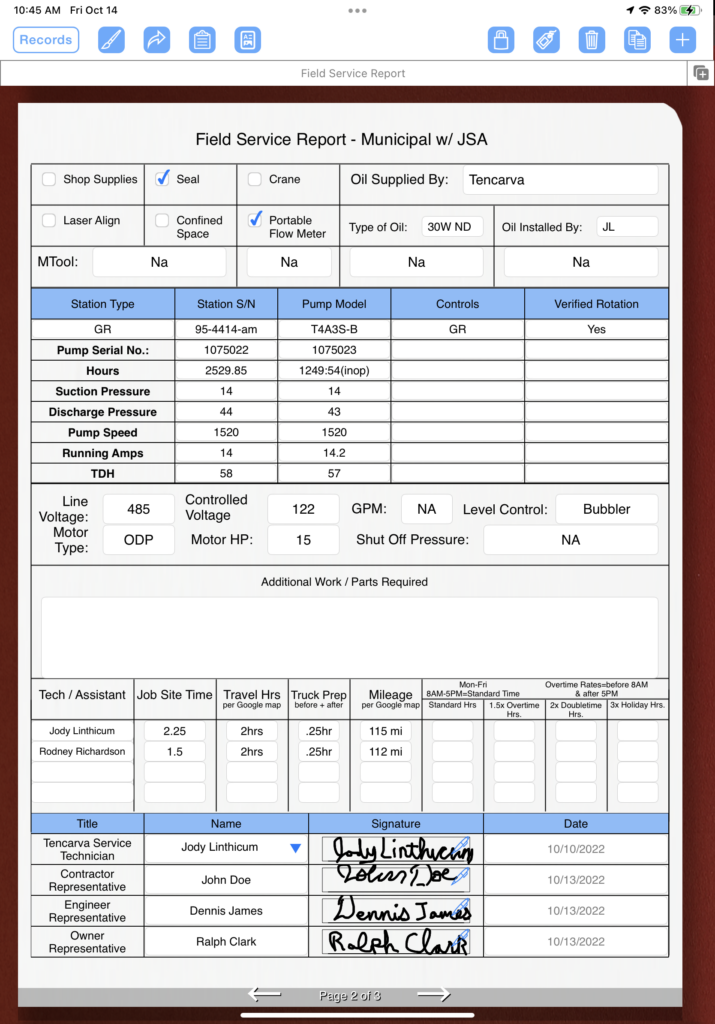
One of the joys of creating a form using the FormConnect Pro+ app is the freedom that you have to customize it the way you want it to look. Below is a form I built recently that encompasses several new features.
Beginning at the top of the form, each of the fields are separated with horizontal and vertical lines. This separation provides for a clean look. Further down the form is a table layout that is organized into nine rows and five columns. The columns are spaced far enough apart so that the text entered is easily readable and the top row adds a blue background color to make the headings stand out. Then, in the middle of the form are text fields for entering data. And towards the bottom of the form are two different types of tables for entering text, numbers, dates, and signatures.

