I recently read a post by a form designer that recommended that a single column should be used for the layout of your form. His point being that multiple columns disrupt the vertical momentum as your scroll through the form.
I disagree with this recommendation. I believe that multiple columns should be used and are a superior utilization of space when filling out a form on an iPad.
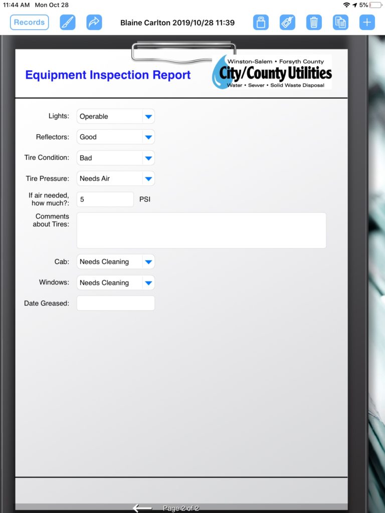
In the example below, I demonstrate using a multi-column layout versus a single column layout. The multi-column layout results in a one page form versus the single column layout, which results in a two page form.