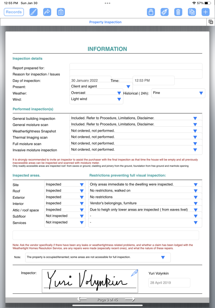
When designing your form, it’s good practice to try and keep your fields and text aligned. That way, when filling it out, it makes it easier to read. Below is an example of a form where there is a text heading on the left followed by one or more drop-down fields on the right. Reading left-to-right, it’s very easy to understand the information that was collected.
