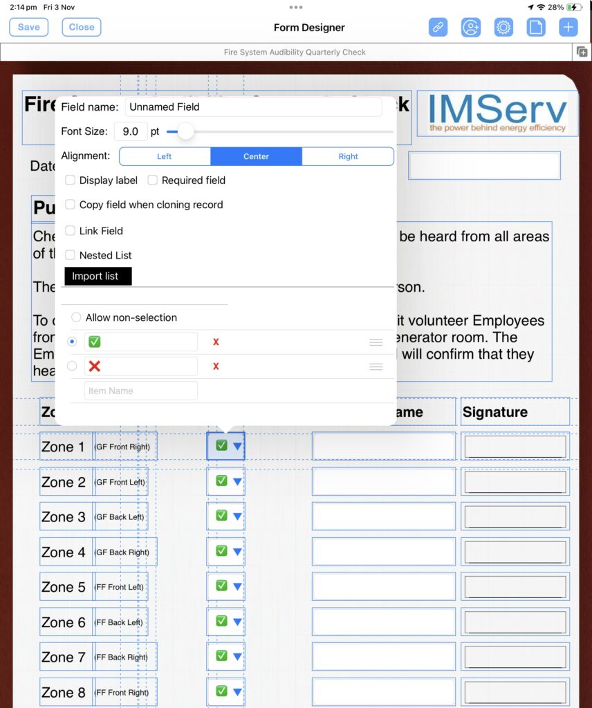
The FormConnect Pro Plus app allows you to create a dropdown list which is a common form elements that allow a user to select from a pre-defined list of choices. They are often used to collect user preferences or data, such as country, gender, or occupation.
Most dropdown lists contain text descriptions, such as “Yes” or “No,” or a list of names to choose from. However, you are not limited to entering just text descriptions. You can also add graphics, such as icons or emoji, to your dropdown lists.
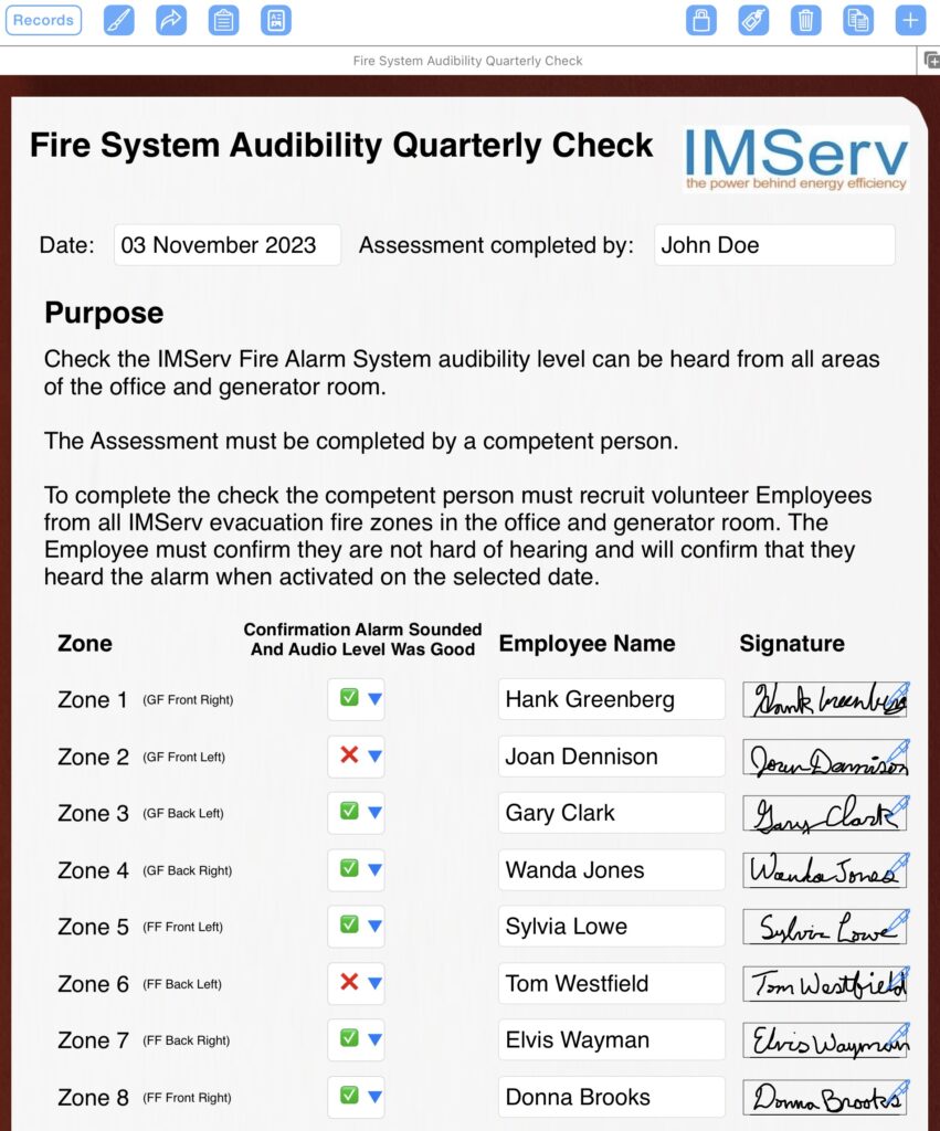
Using graphics in your dropdown lists can make them more visually appealing and informative. For example, if you are asking users if they agree to your terms of service, you could use a green check mark icon to represent “Yes” and a red X icon to represent “No.” This would make it clear to users what each option means and help them to make their selection more quickly.
Here are some tips for using graphics in your dropdown lists:
- Use simple, easy-to-understand graphics.
- Use consistent graphics throughout your form.
- Make sure the graphics are large enough to be seen clearly.
- Use alt text to describe the graphics to users who cannot see them.
Below is an example of a dropdown list that uses graphics. It uses icons (green check marks and red Xs) to represent “Yes” and “No.” This makes it clear to the user what each option means and helps them to make their selection more quickly.


You can also use emoji in your dropdown lists. Emoji are a fun and engaging way to add personality to your forms and make them more user-friendly.
Here are some tips for using emoji in your dropdown lists:
- Use relevant emoji that are related to the topic of your form.
- Use emoji sparingly. Too many emoji can be overwhelming and distracting.
- Make sure the emoji are large enough to be seen clearly.
- Use alt text to describe the emoji to users who cannot see them.
Using graphics and emoji in your dropdown lists is a great way to make your forms more visually appealing, informative, and user-friendly. Experiment with different graphics and emoji to see what works best for your audience and your forms.
